
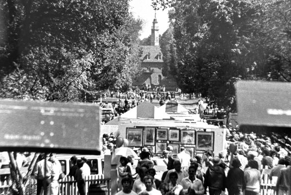
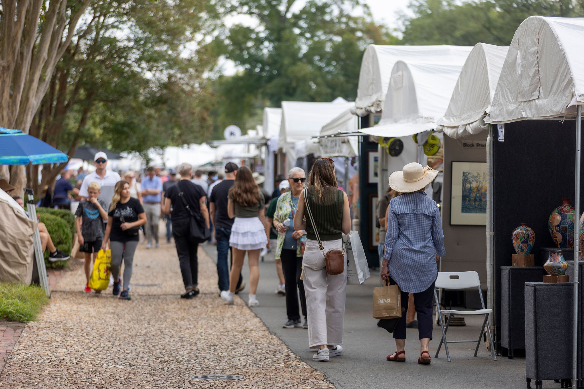
For nearly sixty years, An Occasion for the Arts has brought together artists, neighbors, and visitors in a shared celebration of creativity in Williamsburg.
Over time, the festival has grown not only in size but in how it presents and supports artists.
As the festival continues to evolve, we’ve taken a moment to consider how our visual identity reflects where we are today and where we hope to go.
The refreshed mark places emphasis on the name itself: An Occasion for the Arts. A clear, typography-led identity creates a steady foundation that allows the artists and their work to take center stage while signaling care, clarity, and intention in how the festival presents itself.
While the visual identity evolves, the spirit of An Occasion for the Arts remains the same: artists, neighbors, visitors, and the shared celebration of creativity in our community.
Our Logo Through the Years
Over the past six decades, the logo of An Occasion for the Arts has evolved alongside the festival itself. Each version reflects a different moment in the life of the event and the community that supports it.
1969–1974

1974–1990s


1996

2014–2025

2026-
* Dates are approximate and reflect the general period each identity was in use.
Looking Ahead
The identity provides a steady frame.
The artists, the work, and the experience of An Occasion remain at the center.
As the festival continues to grow, we remain committed to supporting artists near and far, welcoming new audiences and expression, and creating a space for creativity, community, discovery, and experimentation.
Thank you for continuining this delightful tradition. I love the updated logo!